Spin: Haunch Of Venison
Process Journal: Edition One
August 15th 2010
SPIN
–
Haunch Of Venison
An interview with Tony Brook
A multidisciplinary and innovative design studio based in London, Spin contributes significantly to the standard of excellence within the international graphic design community.
Having worked together for eighteen years now, the studio’s founders Patricia Finegan and Tony Brook are responsible for producing some of the world’s most influential works with clients such as Channel 4, Nike and Deutsche Bank. The studio celebrates its respect toward the discipline of graphic design with self-initiated publishing projects. Known as Spin Papers, the publications showcase subject matter that defines Spin’s culture, identity and mindset—an undertaking that clearly illustrates the enthusiasm of the team.
Regardless of the project size, the work at Spin is always sophisticated, conceptually sound and groundbreaking; thus it comes as no surprise the studio possesses countless awards and an impressive international reputation.
When was Spin first approached by Haunch of Venison (HoV)? And what did the initial brief entail?
We were approached at very start, before the gallery even had a name. We worked with the directors on all aspects of the gallery’s image.
In previous interviews you have mentioned that at Spin ‘ultimately everyone is at the coal face’ and it really is a team effort. Was this the case with the HoV re-brand and if so, what was the process involved?
Absolutely—there were consultative meetings with all relevant parties, then I headed a team to develop the identity. After thorough exploration, a name was agreed upon, but when it came to proposing a graphic solution there was one route we felt [we needed to take] to be stronger than the others. So we presented only that route. It was a memorable moment—we were able to present on the walls of the gallery; our client loved the solution and the core hasn’t changed since that moment.
The final marque takes on a striking yet minimal approach. Can you tell us a bit more about this and how it was developed?
We felt a marque was required, as a shorthand for The Haunch of Venison. The gallery has a distinctive and memorable name, but it’s quite long.The marque itself was inspired partly by the name. A haunch of venison is the leg of a deer, which suggests that there are another three legs of the deer remaining. By drawing a three-legged deer and then removing the head and body you’re left with the logo, which also appears to be a minimal H and V.
Could you talk about some of the challenges that you faced, particularly in relation to working with a gallery?
We had to appeal equally to gallery directors, artists, collectors and the public. We still do. Everyone has an opinion and jobs are always a balancing act.
The HoV graphic language and branding is very strong throughout the various applications and advertising collateral. Did the identity evolve organically with new applications or was this flexibility developed as part of the initial identity?
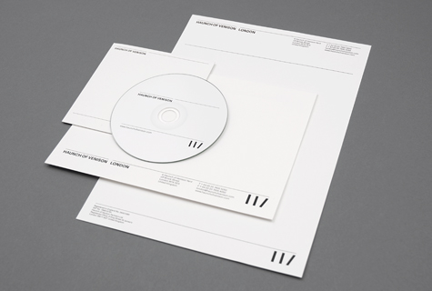
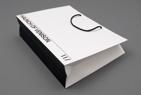
The identity and its applications has evolved and been consolidated over time, but the flexibility of the system was a core part of the solution and developed from the very beginning. As the gallery has expanded globally, the system has been able to accommodate a set of different locations while retaining its strong brand values. Over time the identity has become more rationalised and stripped back—it’s now just used in black and white and applied with a consistent grid across all the different elements.
Despite its minimalism, the identity allows a great deal of freedom. It’s possible to see its application as working in two layers—a strict and consistent corporate layer holds the Haunch brand along with the gallery and artist details. The layer beneath this is much freer and allows for an expressive approach in representing the artist, both in terms of image and typography. This is usually the more contested space where our ideas have to strike a balance with the thoughts of the artist and gallery. But debate and discussion usually makes for stronger design.
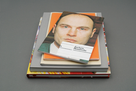
Many of the catalogues produced for HoV are individually suited to the artist(s) showcased, but the HoV branding is rarely (if at all) included on the cover. In what other ways does the collateral identify itself as HoV?
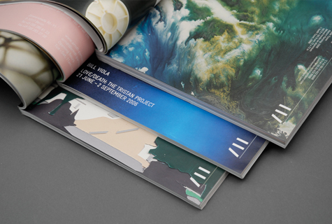
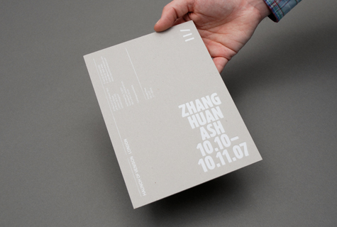
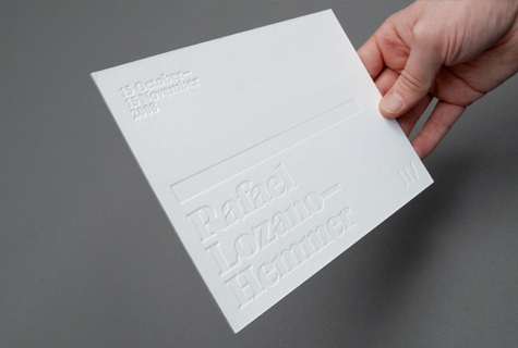
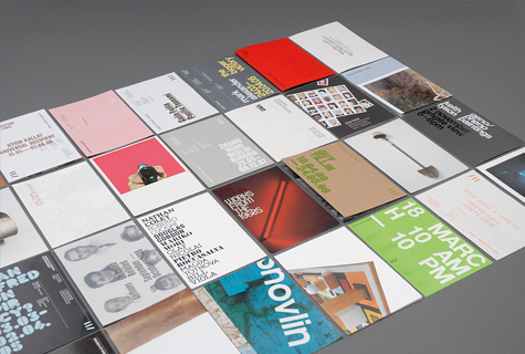
Actually, the Haunch brand is always included, but it’s restricted to the back cover—sometimes the spine too, if it’s wide enough to allow the logo at an appropriate size. On occasion the brand can be quite subtle—perhaps blind de-bossed, or printed in gloss UV varnish—but it’s there. The front covers of Haunch catalogues are often fairly reduced; they employ simple, but striking typography, bold imagery and an inventive use of materials. It’s this approach that is the unifying aspect of the identity.
Generally speaking, how important is it to include a traditional logo, mark or corporate branding on the cover of a publication or collateral?
It’s certainly important to brand a publication, but it’s not always necessary to shout. The marque should be used at an identifiable size and not dominate—it’s literally a mark, and shouldn’t be considered an artwork in its own right.It’s there as a quality stamp.
It is apparent in the final outcomes that the HoV projects enable Spin to experiment with different materials and processes. How integral is the client’s role in enablinga designer to do this?
It’s vital. Without such an adventurous and progressive client, it would be much harder to produce continually challenging work. But then, while it is commercial, the fine art world is also much more used to being challenged in this way—it wouldn’t be appropriate to produce some of the more elaborate pieces we do in a more corporate environment.
What have been some of the bigger challenges you faced in the HoV projects when experimenting with these different materials and processes?
Careful planning usually helps mitigate some of the more challenging aspects of production. We talk to printers, binders and suppliers to get as clear a picture as possible of what pitfalls we might encounter on a job. Dummies and samples are very important. Time is usually more of a constraint than we would like and occasionally we have to work around something that sounded achievable at the start, but ended up being impossible or very costly. We once had to hand-clean every single private view invitation when the dust created by laser-etching the design had not been properly removed.
The HoV signage also takes on the minimal approach deployed throughout the branding. What was involved to adapt the identity to a three-dimensional application such as a building façade or freestanding sign?
In early 2009 the gallery moved premises to a much larger building in Burlington Gardens and this meant we had to consider not only how we would present the identity to the wider public, but also help them navigate the bigger space once inside the gallery. Previously we had created window graphics for each exhibition, but it was clear we would need to take a different approach in the new building which was much more public-facing.
The move helped clarify the corporate aspect of the identity, which we subsequently applied to the signage both internally and externally. We’ve had to consider how it could be applied to different materials, but also work within the confines of a listed building on a busy and dirty London street. Much of the internal signage is produced with cut vinyl—it’s a relatively cheap and flexible solution which accommodates the rolling programme of exhibitions. The free-standing signs allow the gallery to communicate even more localised information—we created a template for staff to update as and when required. We designed the stands themselves almost as if they were small-scale banners, so that there is a continuity with what a visitor sees on the outside of the building.
–
www.spin.co.uk
www.haunchofvenison.com