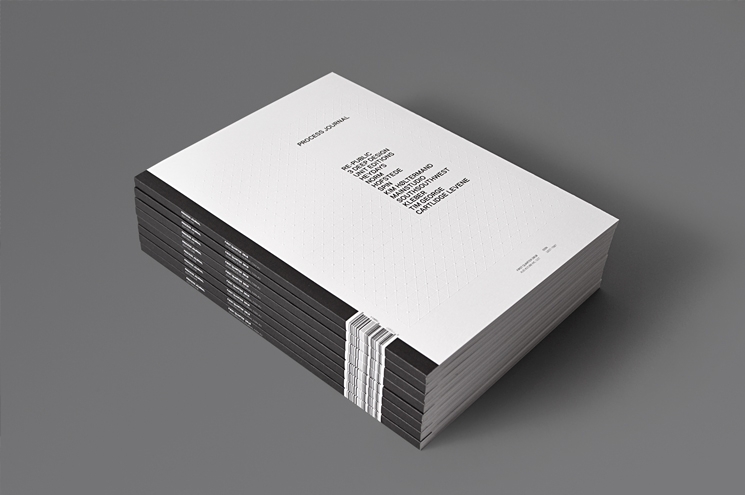
Process Journal: The Rationale
Process Journal: Edition One
June 9th 2010
The Rationale
The design philosophy of Process Journal is quite simple; our goal was to create a portfolio that displays the work that designers do in the best possible way.
Although there is plenty of inspirational content available online, we felt that the print medium could offer a different kind of reading experience — a more tangible and immersive engagement with designers than one might encounter in the transitory and cluttered universe of the internet. Plus, our background in print design meant that producing a 'journal' seemed like the most logical choice.
Adrian Shaughnessy (a contributor in the first edition of Process) captured this notion perfectly:
'The problem with the internet is, sure, you can find imagery, but it usually comes without any context, and more importantly, you often can't find it a second time. A book is permanent. It's good technology—doesn't need batteries and you can drop it and it won't break.'
Although our readers may have already seen some of our images online, Process is not about breaking the latest design news; it is about taking a look behind the scenes at the process and understanding the journey the designer(s) have undertaken to arrive at the final product—hence the journal's title.
This sense of movement and transformation is also reflected in our editorial decision to produce the bulk of the journal as a series of interviews. We are not about delivering strong editorial opinions in a magazine or news format, rather, we like to consider Process as more of a printed documentary that falls somewhere between a book and a magazine.
Beyond the simple aim of capturing beautiful design, we also look at Process as a creative outlet and project for our studio. As Process isn't accompanied by any client or other specific requirements we have an open brief, which enables us the freedom to experiment. Our aim is to build Process up to become a great source of design inspiration, and not just for our studio, but also for the wider design community.
The Grid
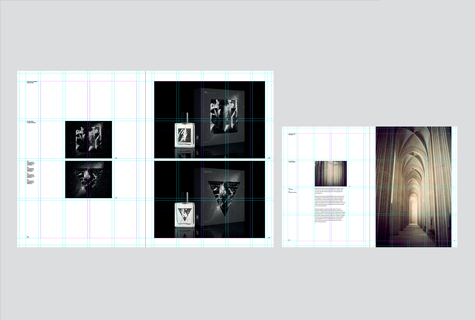
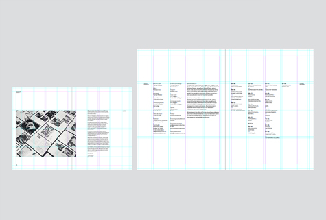
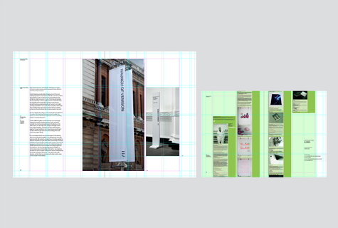
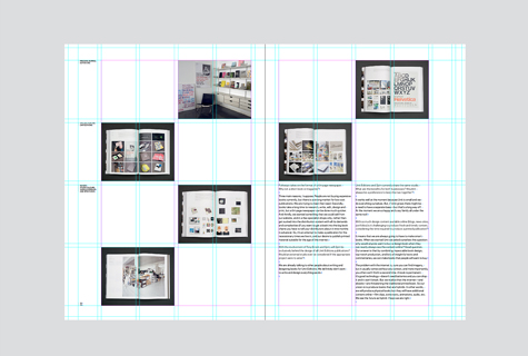
In keeping with the Process philosophy of designing a 'portfolio', it was necessary to develop a grid system to use throughout the publication. As in the design of an art catalogue, the most important thing for us was to exhibit the images in such a way that the design of the journal itself didn't overwhelm or interfere with the aesthetic integrity of the featured work.
The grid is structured horizontally according to a standard four-column layout with 15mm top, inside and bottom margins. The outside margin was increased to 40mm, creating two smaller sub-columns, with the left-hand column used exclusively for page titles, image captions and pagination. This also enables the reader to comfortably hold the journal and not have his/her thumbs encroach on the written content.
The page is divided vertically into quarters (essentially two overlapping two-column grids of the same proportions), which share the same 4mm gutter used in the horizontal grid. This enables greater flexibility with the placement of text and images, as well as a centered layout on the page that falls within the grid guidelines. We also developed various rules to create further consistencies and constraints within the grid. An example of this is that the only written content to appear in the top quarter is the title and edition number. The only exception to this rule is the placement of the feature titles to enable greater flexibility in the placement of a hero image.
The Typeface
Galaxie Polaris (Vllg) was chosen as our primary typeface for Edition One. We chose this modern sans-serif as we feel it holds a certain subtle individual character while still retaining quite a neutral feel. We also decided to only use a single typeface (with the exception of a featured typeface in our typographic feature) for the headings, subheadings, body and captions. Consequently, we needed a typeface that worked in large and small sizes, and in dense quantities, and that had varying weights for the creation of typographic hierarchies. We originally considered several other typefaces including Akzidenz Grotesk (both normal and condensed), but after laying out and typesetting a few sample spreads, we felt that Galaxie was a less obvious choice and more appropriate fit for our first edition.
Process Continues
Right now we are currently working on Edition Two of Process, and have already secured some very exciting content and contributors, along with a new typeface and some new production processes. In the meantime, Edition One is available (shipping worldwide) at our online store here.